OUP: English Language Teaching
I was the lead UX Architect on a two-year project to retrofit responsive design into Oxford University Press’ existing English Language Teaching (ELT) website, and comprises of over 5,000 pages and averages a million visitors every month. The existing website used a 960px fixed width design.
As the first responsive design retrofit project that our team had been involved in, part of my role included researching and advising on a suitable strategy for accomplishing this. I inputted into an implementation plan covering key areas to focus on and ways to improve site performance for delivery to mobile devices, and selected target mobile devices based on web analytics from the current site. We also defined the key goals for the project, including measures of success.
Working in close collaboration with business stakeholders, we decided to approach the project on a component-by-component basis and ran workshops to work through the content priority for the key templates. To achieve this, I encouraged a mobile first approach where I asked business stakeholders to consider the user’s top tasks for each page, referring back to our personas where necessary.
Starting with sketching and low-fidelity wireframes, and progressing onto designing in the browser with the front-end developer, we were able to illustrate multiple approaches for converting each site component into a responsive equivalent – drawing on best practice and the organization’s pattern library, which I am one of the main authors of, where needed.
We also assembled a style guide to illustrate the various responsive components and to demonstrate how to apply them, so that the ELT Digital Marketing team can follow the guidelines when adding new content to the website.
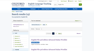
I conducted multiple rounds of usability testing with teachers and students to validate our designs and identify problem areas, which I reported back to the business stakeholders and provided recommendations for improvement. The tasks I tested were based on key user journeys for the existing desktop site, such as searching the catalogue and downloading teaching materials. Some of our findings led to multiple design iterations and repeated usability tests to validate our revisions.
The first set of responsive pages were released in January 2016, with the next set launched in August 2016. Analytics show an improvement in e-commerce sales since the responsive pages were launched and mobile usage has steadily increased compared to the previous year.